Responsive React Components
Over the past 12 months the Sky Vegas Squad have been building a single, fully-responsive platform that allows skyvegas.com players instant access to their favourite slots and table games regardless of the device with which they visit.
Powered by React, the project as a whole has provided an amazing learning curve for all squad members - whether wrapping your head around the flux architecture (especially when coming from an MVC background!) or truly understanding the specifics of React itself, to have been a small part of such a great squad and watching the dynamic change across the team as knowledge is shared and confidence has grown, is truly an honour.
Anyway, I digress.
One of the last and arguably most important pieces of the single platform jigsaw was the “road to mobile” or in more verbose terms; ensure we create absolute feature parity between the existing (and soon to be retired) dedicated mobile website and the new responsive website.
Part of this “road to mobile” entailed designing and creating or updating React components which were initially conceived with a single (larger viewport) device in mind. Over the course of a couple of months with many components being created or updated independent of one another by different developers, it quickly became apparent that between us we had come up with various different solutions at solving the same problem and in the process created some pretty daft technical debt in our shiny new codebase.
So, what was the actual problem we were trying to solve?
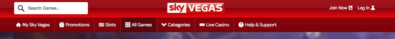
The Sky Vegas website needs to render different React components depending on the users current viewport size. A perfect example of this would be the new Navigation.
With lots of screen real-estate we have the room to render the Navigation component as a full-width horizontal menu:
However, should the user be navigating on a device with a smaller viewport (such as a mobile phone or tablet), our design team don’t have as much screen real-estate to play with and have decided to render the main navigation within a ‘burger menu’ icon:

In short, we needed a way to render different react components depending on the current viewport size of the customer.
A quick search for the problem provides two seemingly popular options; the classic Javascript Window.matchMedia() and the react-responsive:
matchMedia() Implementation:
if(window.matchMedia("(min-width: 400px)").matches) {
    // the viewport is at least 400 pixels wide
} else {
    // the viewport is less than 400 pixels wide
}
react-responsive Implementation:
var MediaQuery = require('react-responsive');

var A = React.createClass({
  render: function(){
    return (
      <div>
        <MediaQuery minDeviceWidth={400}>
            <div>the viewport is at least 400 pixels wide</div>
        </MediaQuery>
        <MediaQuery maxDeviceWidth={400}>
            <div>the viewport is less than 400 pixels wide</div>
        </MediaQuery>
      </div>
    );
  }
});
Looking at the implementations above you’ll see that each option requires the hard-coding of pixel breakpoints at which you would want to render a different component.
At the late stages of this project and Sky Vegas being a relatvely large squad at the time, this classic code smell was missed and as different engineers cracked on with rendering their own little components into various device-widths both variants of this technique for handling components started to appear in our shiny new codebase.
After implementing the initial approaches and realising what effects they would have on future development of the codebase, a tech debt ticket was raised and we set about coming up with a solution to the problem of littering our code with multiple device widths across dozens of components.
Our Solution
We created a Window class designed to wrap native window by using Bean the framework-agnostic event manager.
File: Window
import viewportChangeAction from 'viewportChangeAction';
Bean.on(
  window,
  'resize',
  this.context.executeAction(viewportChangeAction)
);
This then allows us to listen to window functions such as resize and trigger a React Action as a callback to that event.
File: viewportChangeAction
export default createAction('viewportChangeAction', function viewportChangeAction(context, payload, done) {
    context.dispatch('VIEWPORT_CHANGE', payload, done);
});
Dispatching the VIEWPORT_CHANGE on window.resize

The viewportAction is then responsible for dispatching a VIEWPORT_CHANGE event to which the WindowStore handles:
File: Window Store
'use strict';
import {window, document} from 'utils/Globals';
import {ViewportSizes} from 'constants/ViewportSizes';

export default class WindowStore {
    static storeName = 'WindowStore';

    static handlers = {
        'VIEWPORT_CHANGE': 'handleViewportChange'
    };

    handleViewportChange() {
        this.getWindowData();
        this.emitChange();
    }

    getWindowData() {
        this.width = this.getViewportWidth();
        this.height = this.getViewportHeight();
        this.currentViewportSize = this.calculateViewportSize(this.width);
    }

    getViewportWidth() {
        return Math.max(document.documentElement.clientWidth, window.innerWidth || 0);
    }

    getViewportHeight() {
        return Math.max(document.documentElement.clientHeight, window.innerHeight || 0);
    }

    calculateViewportSize(width) {
        if(width < 741) {
            return ViewportSizes.PALM;
        } else if (width >= 741 && width < 1025) {
            return ViewportSizes.LAP;
        } else if (width >= 1025 && width < 1200) {
            return ViewportSizes.DESK;
        } else {
            return ViewportSizes.DESK_WIDE;
        }
    }

    getCurrentViewportSize() {
        return this.currentViewportSize;
    }
}
File: ViewportSizes
import keymirror from 'keymirror';

const ViewportSizes = keymirror({
    PALM: null,
    LAP: null,
    DESK: null,
    DESK_WIDE: null
});

export default {
    ViewportSizes
};
This store holds, calculates and exposes the currentViewportSize as a string from the ViewportSizes constants file.
A component interested in using getCurrentViewportSize() from this store can utilise the connectToStores fluxible add-on to gain access to any emitted updates.
File: AnyComponent
import {connectToStores} from 'fluxible-addons-react';
import WindowStore from 'stores/WindowStore';
import {ViewportSizes} from 'constants/ViewportSizes';

@connectToStores( [NavigationStore, WindowStore], (context, props) => ({
    viewportSize: context.getStore(WindowStore).getCurrentViewportSize(),
}))

class AnyComponent extends React.Component {

    static propTypes = {
        viewportSize: PropTypes.oneOf(Object.keys(ViewportSizes)).isRequired
    }

    render() {
        let size = this.props.viewportSize;

        // This is where the magic happens
        let menuButton = (size === ViewportSizes.PALM || size === ViewportSizes.LAP) ? <MenuButton/> : null;

        return (
            <div>
                <Search/>
                {menuButton}
            </div>
        )
    }
}
As can be seen in the AnyComponent component above, it simply listens to changes emitted from the WindowStore, compares the current viewportSize string with the constants defined in ViewportSizes and decides whether to render the MenuButton child component or not.
Our Learnings
The spotting, discussion and implementation of correcting technical debt is absolutely crucial to helping keep our codebase as clean as possible. Every engineer takes responsibility in bringing awareness of encroaching technical debt. This particular problem is a prime example of a member of the squad seeing a future problem forming and actioning a solution as quickly as possible.
From a technical standpoint, the pairing of Flux architecture with an event manager is an interesting one. For this piece it has allowed the squad to abstract out the actual breakpoint values from each component, this single capability as enabled a great power of rendering anything we like from within a component while making for an easier upgrade path when inevitable “standard” device sizes change.